Designing With Red-Green Color Blindness In Mind
|
Author: Hanna Hagenmalm The topic for this post is going to be accessibility. I’ll be exploring how to design for people with red-green color blindness, and how I’ve tried to apply those principles to the game’s background. As a team, we decided to put extra focus on accessibility. This included the ability to play the game with one hand only, supplementing auditory cues with visual ones, and creating assets that would work for people with mild visual impairment. The reason for this was simple. Allowing more people to play is never a bad choice. From a purely economic perspective, the more people that play a game, the better. 7-10% of males and 0.5% of females are red-green color blind – in a world of 7.5 billion people, that is a big number. Add to that blue-yellow color blindness, total color blindness, and the fact that the ability to perceive colors decrease with age, and you have a good argument for inclusive design. Personally, I also feel it’s about contributing to a more accepting, empathic society. Hopefully, by trying to be more inclusive, I encourage others to as well. A common argument I hear against inclusive design is that it takes extra effort and resources. In this case, I didn’t feel that it would. There are many different ways of designing assets. Whichever way is chosen, research has to be done, regardless of whether color theory, certain design principles, or a theme is the guiding hand. Another argument is that, not every game is for every person. And I can agree that designing one product for everyone regardless of taste is bordering on impossible. Rather, I think that accessibility is about allowing everyone with that taste to partake.
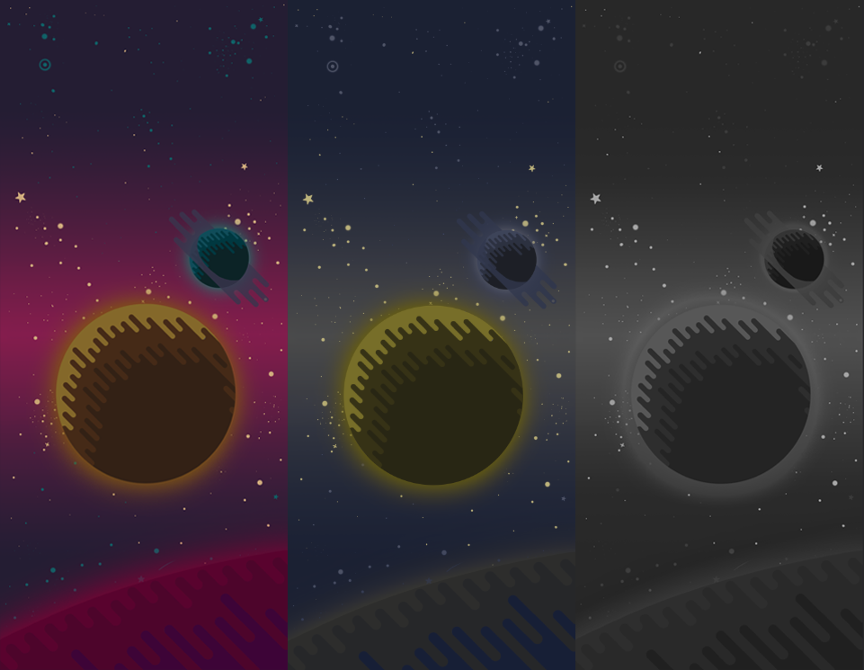
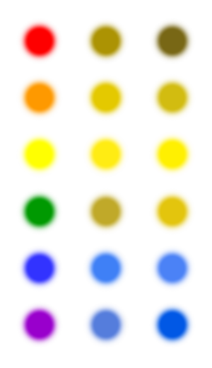
So, as an artist, I took on the task of creating accessible visuals, with focus on red-green color blindness. For anyone interested in trying what color blindness can be like, there is an in-built tool in Photoshop, under View->Proof Setup->Color Blindness – [Type]. Online research revealed a wealth of information. The main principle to keep in mind, was that the asset should read well in greyscale. Then, regardless of color, a color blind person will be able to distinguish what is going on. As it so happens, employing value contrasts is generally considered a (subjectively) good design choice, as it tends to lead to more interesting, dynamic designs. So, it felt natural that the background should hold the darkest value. The enemies should be light, and the avatar glowing. Distributing the values this way would hopefully draw attention to where it’s needed on the screen. Another suggested guideline was to employ a variety of shapes and patterns. The purpose is to provide additional cues that help differentiating two artefacts from one another. The art style we had chosen lent itself well to this, and I designed the planets in the background with patterned shadows. And finally; colors. Looking at a chart for color blindness, it seemed to me like blue and yellow were the easiest for red-green colorblind people to perceive. That, to me, meant that those colors should be reserved for the avatar and the enemies, since they are more important to detect than the background.
Here is where I made a mistake. I misinterpreted what color blindness means, and reasoned that I could use saturated hues of red, pink and purple for the background – because they would be perceived as greyish by red-green color blind people, right? Wrong. Photoshop’s Proof Setup quickly showed me the error of my ways. The red, pink and purple turned into various shades of blue and yellow. Which was entirely logical, based on the color blindness chart. I had a few options at this point. I could try to create a palette that would work for both visually unimpaired and red-green color blind people. However, color blindness is a spectrum, and tinkering back and forth with a broad palette, trying to achieve an appealing look without knowing how it would actually look to the intended audience, felt like a daunting task. I wanted more control over the aesthetic experience the game was meant to deliver. I pitched the idea of a greyscale mode for the background to the programmers, who said it was easy to implement. Offering the background in greyscale would make use of the value contrasts I had already painted, as well as allowing the colored units to be as visible as they possibly could. Hopefully, it would also deliver a visually beautiful experience to a broader audience. |