Last Week – Improving the Level Visuals
|
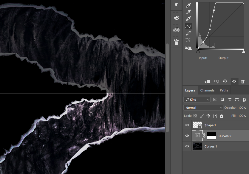
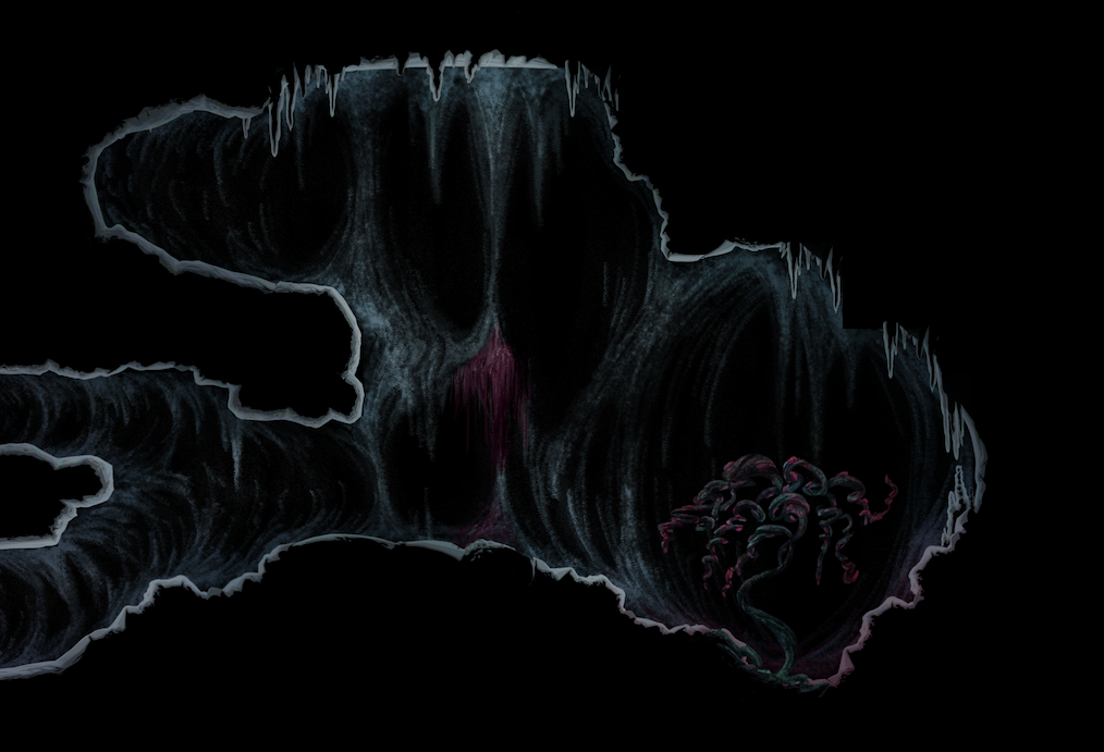
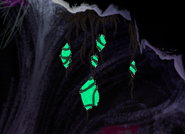
Why This last week has been relatively composed for the graphics artists. The amount of assets we have produced surpasses the implementation that the coding team has been able to do up to this point. We agreed that the best course of action for the artists is to refine the already implemented assets to make a greater visual appeal. Amongst these assets were the level sheet. What I have been working on finishing the level graphics that was nearly completed by the last post. We received some criticism when presenting our game largely based on the fact that everything was too dark. So I decided to refine the levels brightness and character. We decided to add as much detail as we could to the level to make up for the lack of implemented visual elements. This also included populating the level with plants and crystals How The levels dark visuals was easily fixed using Photoshops curve tool. I simply cranked the brightness while still trying to preserve the contrast of the edges to the background. The curves tool used to brighten the edges of the level (masked to the lower part of the level for visual clarity) The populating of the level was first handed to who had Tove made all of the decorative assets for the level so far. She was instructed to populate the level in the style of a mockup I threw together as reference:
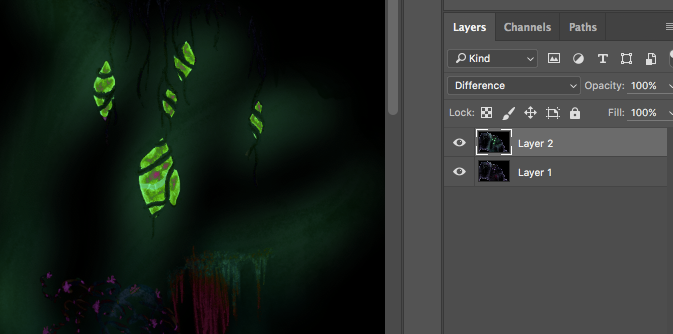
The mockup provided, showing a tree and some moss hanging from the rocks. After Tove had made the majority of the work I would take the result and add to it. Due to some miscommunication Tove had added glow to the crystals, this wouldn’t look right as the only lighting source we had in the game was from the player. Fixing this was an easy task though as I could just mask the lighting with the original image and still keep the added assets. I automated this by using a difference profile from the new compared to the original and used as a mask for the new assets.
Getting a difference profile to use as a mask. I achieved this by simply overlaying Toves image on the original and setting the blend mode to ”Difference”.
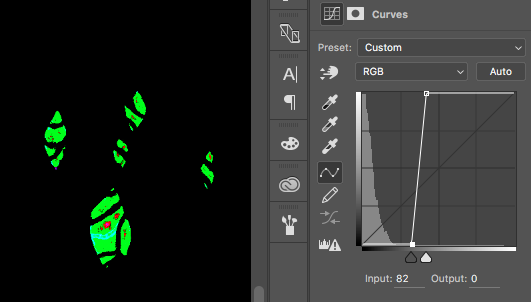
I then crank the curves to isolate all parts that have a distinct difference to the original (as the lighting has a lower opacity).
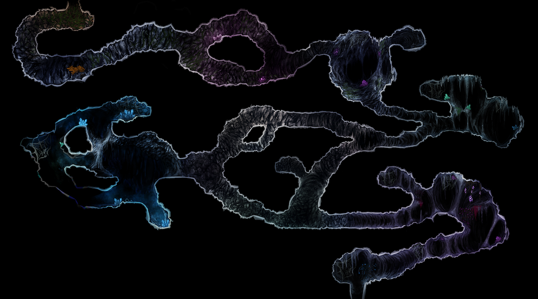
I then use the difference profile as alpha layer on Toves image and adjusts the mask edges using Photoshops ”Smart radius” tool. I revised the level a day later, realizing that some parts of the level could be more communicative. For example, the tree in the beginning (originally put there to add some orange color and to make the player feel more comfortable) would be moved to the first cave as it occupied too much space and made the player feel cramped. The feeling of going to a less secure place was kept intact by coloring the cave and having it transition as you go along. I also tried making the rooms color themed to help the player recognize rooms and to give them a personalized feeling.
The end result was much brighter and has a clear color theme. The colors look almost too bright for such a dark game, but look good in-engine. |