Week 6 of Game Development, Pruning the twigs
|
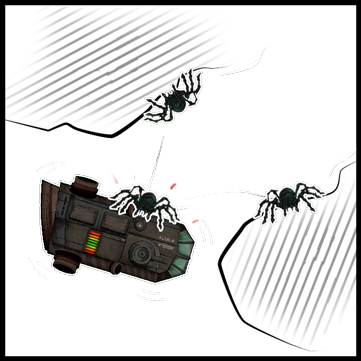
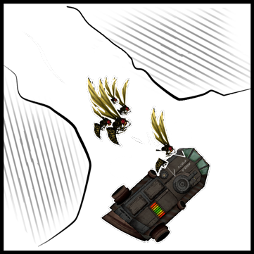
Well, well. Here we are, the last week of game development and the day before the big presentation. The team have been working hard (still working, and probably will until there is only one minute left to the deadline), and we have now something pretty playable. At least much better then the last milestone, the Beta. There is a lot left to do though, and a lot that we can’t ever in a million years finish. But for us graphical artist there have been nothing new to do really. All the graphical artifacts are done, and almost all the sound ones too. So all the artifacts this week have just been about making some small fixes and touch-ups to our previous assets. Overall though, the biggest and most important artifact this week for me, and the one I’ll write about, have been the making of mock-ups for our Game Design Document. So you might ask why I’m making mock-ups for our document, or you might even ask, weren’t you already finished with it? Well yes, we had “finished” it and turned it in. But unfortunately it was pretty lacking and we received a lot of feedback on what we could improve on. So this week and last week we have been working on the document. We have all been editing and adding new texts. But I’ve also taken on one of the bigger artifacts, of making mock-ups. As the biggest complaint on our document was the lack of pictures explaining movements and the likes. This is something we all agreed on lacked last time. But it was something we didn’t prioritized doing or implementing last time around. It wasn’t until later we realized its actual importance. As pictures often more easily convey information and it can make it more bearable reading a wall of text. And like the saying goes, a picture says more then a thousand words. So, in the making of these mock-ups, I decided to go with a pretty simplistic style. So I outlined the walls instead of using the actual background pictures, and also added outlines to the enemies and the ship to make them stand out more. I used the actual sprites from the game, to make it easier to see what’s what. Instead of having shapes like squares representing them. I think this was a good choice. But hindsight, I think it would have been better if I made the sprites in solid color. Since all the details on the ship might make it a bit cluttery, and harder to read. It also might clash a bit with the more clean comic style. But I think in the end it does its job well enough. Here you can see some of the mock-ups I made for the document.
Thanks for reading my reflections, and I hope you had a fun read! This is the last one for this course too! S o nobody will be unnecessarily tortured again, well unless you chose to read it Bye bye, have a nice day! |