Menu Visuals
|
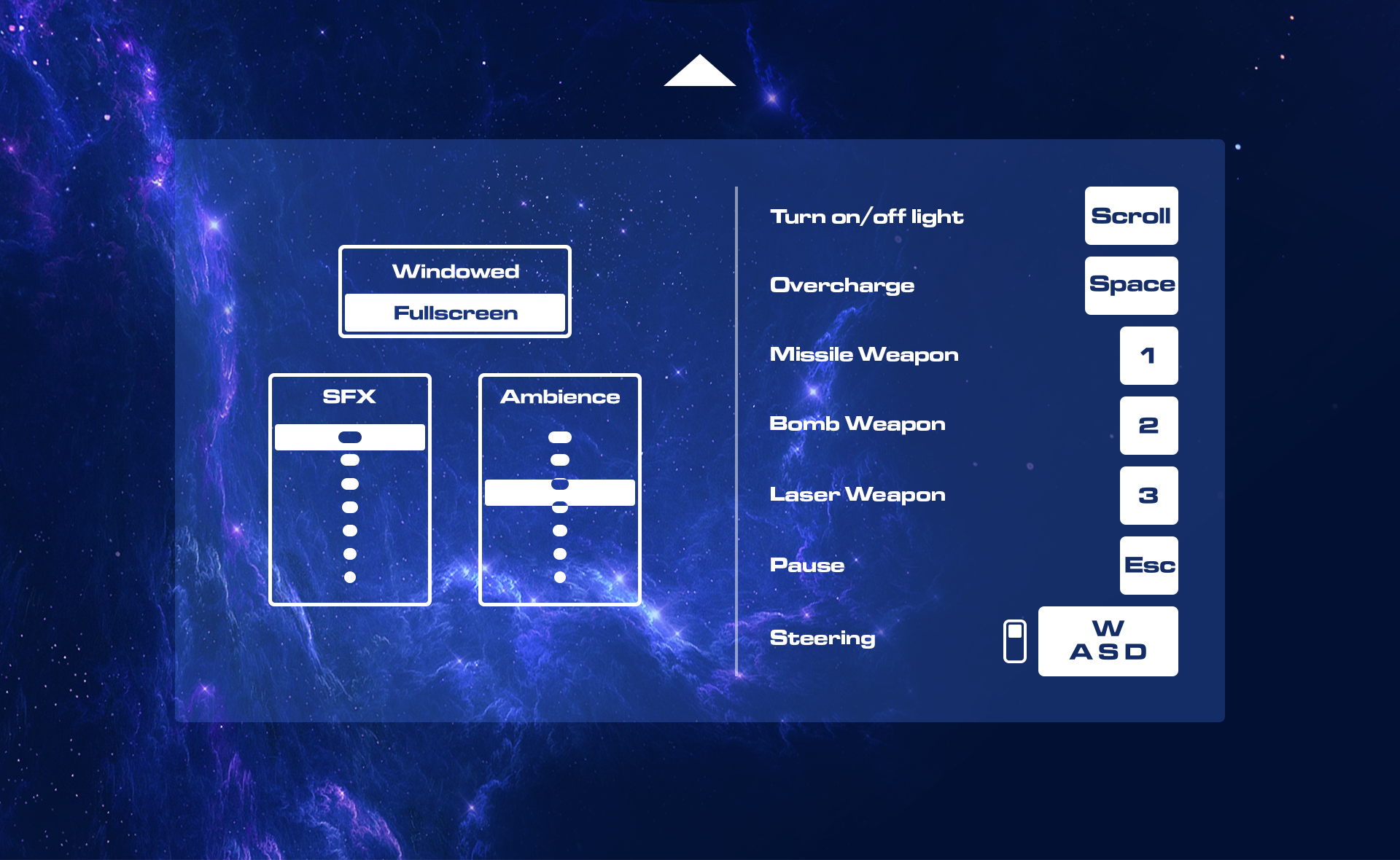
This week I worked on implementing the menu visuals from the menu concepts for Colossus Core.
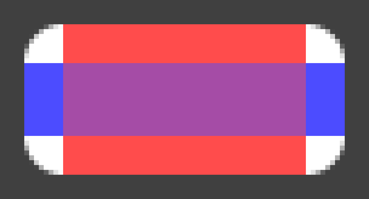
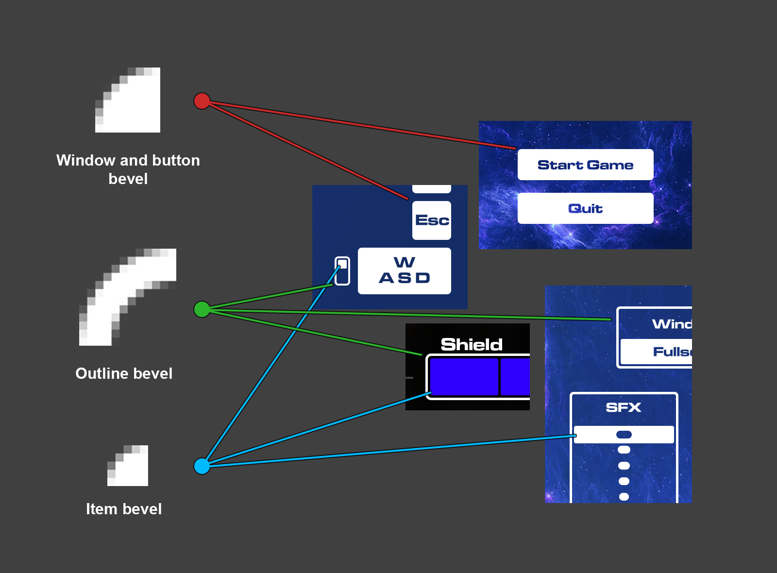
When I made the menu concepts a couple of weeks ago I had the engine implementation in mind. I made sure to use a flat design on all menu items as I had the idea to use blending modes to mask them. I do this simply to avoid using any mask shaders as they have to my previous experinces been a pain to work with. The buttons will be rendered using the screen blend mode (which treats black color as transparent) allowing us to draw black objects as a mask instead. The reason we’re using masks for the text instead of making the buttons as separate images is to allow them to show any text without having to rework the sprites and sheets. They are also designed to be dynamically drawn to any size using only on edge sprite. This is a valuable method as we save RAM usage, however with the downside of using more draw calls. We are not yet aware if this will be a problem or not, but in any case, this method provides a multitude of uses and optimization options whilst the button images do not. The following image shows how the buttons are drawn in engine.
The edges are textures with alpha channels that are rotated or flipped as corners of the button. The red and blue rectangles are overlapping white fills that make up the rest of the button. We’ll be using this technique for all items in the menus (including the window itself) exept for the fonts and symbols.
This means that we can have a minimal sprite sheet for the menu that, if not already in the memory, can be loaded in a split second.
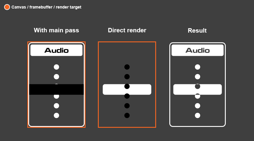
So this week I tried implementing these methods firstly conceptually, then in the engine itself. As of being a graphical artist and not having a working insallation of Visual Studio yet, I decided to start programming the menu in the Love2D framework using lua. The simpler syntax of lua could almost be concidered pseudo code and helps to get a better grip of the draw orders and the variables needed. After having gotten the buttons and text to work in a single framebuffer I started thinking about how I would make an exclude like function for the sliders in the settings menu. I would only be using blend modes and wanted to make a white bar slide over a volume graphic whilst still showing whats undernieth the bar itself. This helps the user see more exactly what value is set both due to the slider thumb piece being bigger, and because the max and min volume points will be centered in the thumb piece when the value is set to the respective value. The following image shows how I solved the problem.
The first item draws everything normally but draws the bar as a black bar instead. The result of this when the buffer is drawn with the screen blend mode is that the dots underneith will render transparent. The middle item is drawn on a separate buffer with only the bar and the dots, the dots being black this time to subtract the shape from the thumb piece. This second pass will have to be drawn separate from the main, on the main buffer. The third item shows the result of the method. In my demo I show the drawing of a window, outlines, the buttons and the value slider. The slider is animated to show the masking on the thumb piece. It also shows an animated image of a cog being used to mask a button, for fun testing purposes. To summarize, this week I figured out the methods required to draw our menu and wrote a program using these methods to test the practicallity and visual quality of them. I was pleased with the results and will hopefully be implementing the code over the weekend. |