A Simple Main Menu
|
As I have not put down a lot of work into artifacts this week I do not have much to show. Most of my focus went in to making a presentation for the alpha reveal. So I will try the best to explain what little I have done! So here we go. 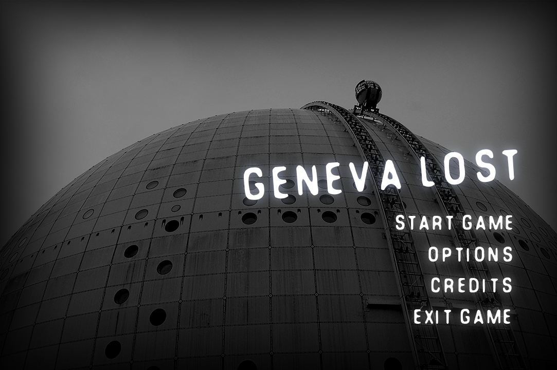
Probably the most visited part of a game is the main menu. It’s also the first thing you’ll see when you start a game. People say that you shouldn’t judge a book by its cover, but we all know that everybody does it. So it’s important to make a good “first” impression. So I sat down and started to get all kinds of ideas of what it could be like, but I quickly realized that i don’t have the time nor the artistic skill to go through with it. So what I did was that I started to think about a simple way to make a nice main menu. I felt that I needed to reflect the same atmosphere that would be in the game, namely the sense of loneliness. And as the game is set in Stockholm, Sweden, a Swedish landmark would be a good addition. I had a look at the mock-up menu made by Marcus Quarfordt, our lead artist, and I made the menu as similar as possible to his. Because Marcus had managed to capture just what I was looking for. You can see the original mock-up, by Marcus, below.  However, the problem with the original mock-up was that it was using a copyrighted image as the background, and that’s something we can’t keep (because of obvious reasons). So I went to the website “Flickr” where you can easily find pictures that you are allowed to share commercially. It took me a while before I found something I could work with, but the filter options provided by Flickr helped a lot. Once I had the picture I was looking for I framed it within a black fade. This helps to bring the focus towards the center of the screen as well as setting the atmosphere. Further on I had Marcus send me the font he was using in his mock-up, which can be found along with many other fonts on “dafont.com”. After writing the necessary menu options I duplicated each layer and added a Gaussian blur to create a glowing kind of effect. I did this to furtherer set the mood, and also because that’s what it looked like in the original mock-up. Finally I scaled the image to match the resolution of our game. I then exported the layers into separate images. I did this in consideration of our programmers as I want it to be easy for them to implement the menu in the game. That’s all I have to say about this menu. There really not much to talk about because the original idea is not made by me. Next week, however, will be focusing on how to create a smooth animation (as per request). I’ll be explaining more about the line of action and other expressions such as “follow through”. So stay tuned! //Simon |