GODFIRE FORGE
Theme Park 2015
The second week of game development is over and I have been pretty busy drawing weapons and working on the game menu. In GodFire Forge the team decided on having three different types of weapons, axes, swords and spears.
The “Rock, Paper, Scissors” mechanic
We were thinking of giving the enemies in our game, the giants, the same type of weapons as the player. The tactic for the player would be like the game “rock paper scissors”. the axe destroyes the spear which destroyes the sword the axe. This way the player can easily see on the screen which weapon has to be forged next in order to defeat the enemy.
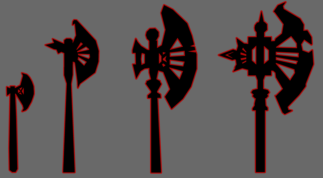
The Weapons
Throughout the game the player learns how to craft more skilled weapons that are more efficient against the attacking giants. Which weapon that increases in level depends on how many weapons are created in that category. For e.g. If you decide to craft alot of battle axes the level of them will increase while the level of the spears and swords are not increased. However the player has to forge more weapons in order to achieve the higher levels of that weapon category. Sofar I have drawn prototypes of possible weapon upgrades. Battle Axes
The first axe shown in the image above is the “starter axe” which will be forged at the beginning of the game. After a couple of starter axes have been forged the axe gets an upgrade and evolves to the second axe etc. When creating the designs and visual appearence of the axes I tried to make a clear jump in the differences from one axe to another.
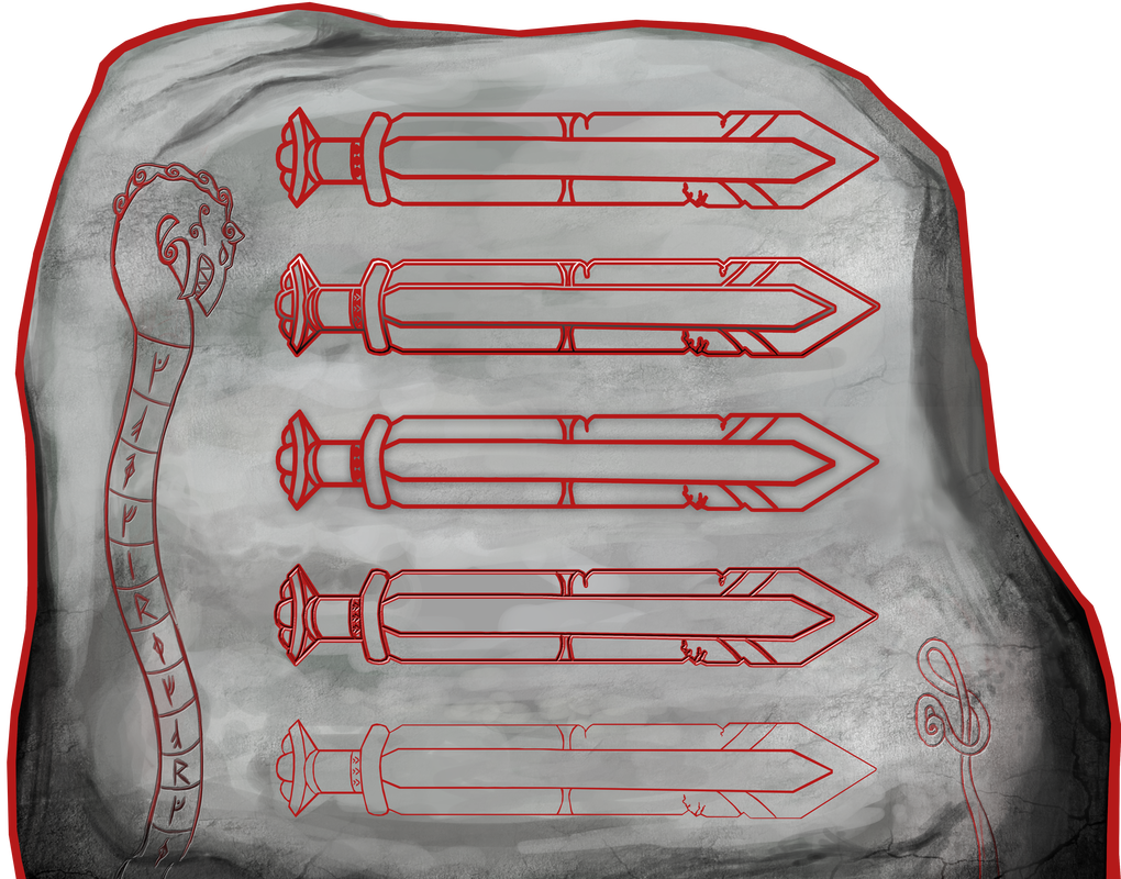
Mighty Swords

The swords above are not represented in the right upgrade order like the battle axes. The first sword was first meant to represent the buttons in our game menu before we got another solution.
War Spears
Different Menu Versions
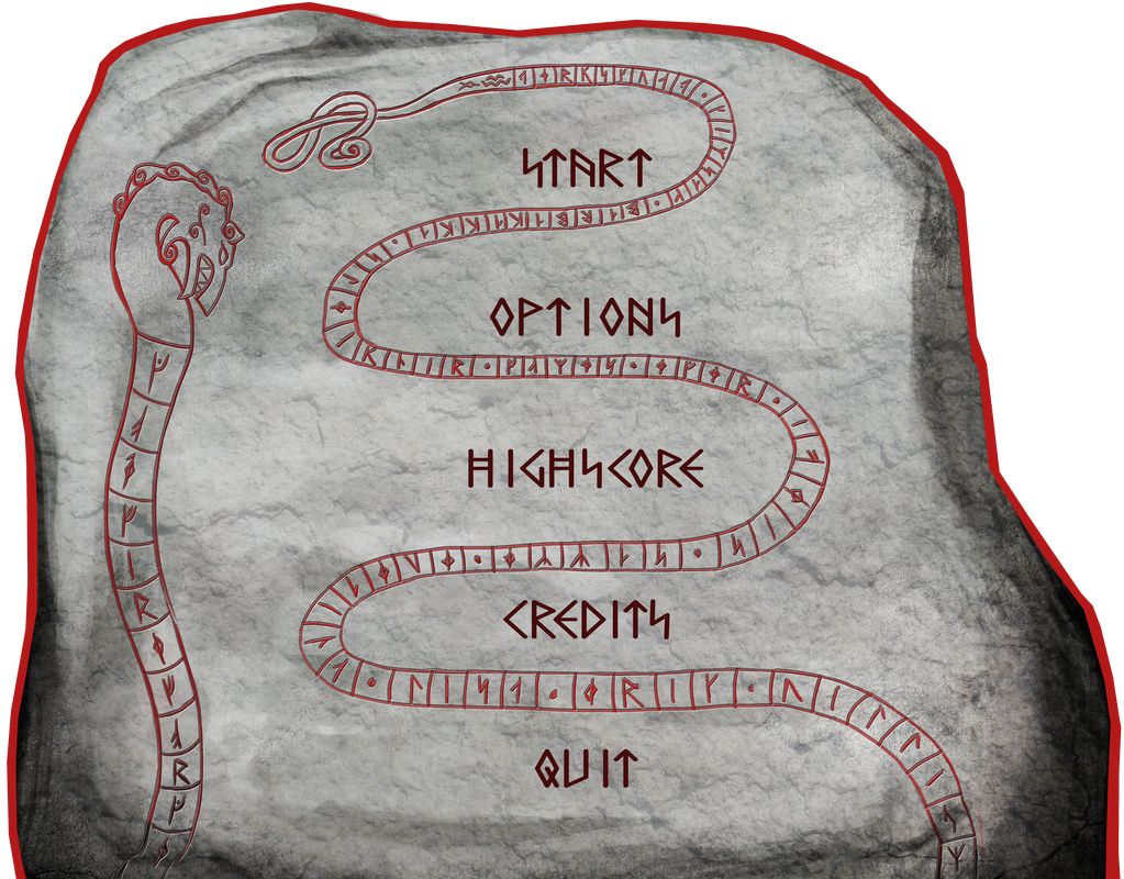
Our game takes place during the viking age within the world of a runestone and our idea was to have the menu be the stone which you would enter by hitting the right rune with your hammer representing the “Start” button. Every visual button on the menu would have a rune which would indicate which “in real life rune” to hit. Here below are some ideas of how I wanted the buttons to look like.
Since we are going to use a projector for our game and it will be played in a fairly bright room we decided to pick the most clean style which was the first button. Next I had to create a font that would fit this runestone. I searched for a rune font at dafont and found this one. I changed the “S” letter which looks like a lightning to stand instead of the original tilting version. We liked how it turned out but somehow their were too many lines everywhere it made it hard for the player to be able to read. That was why I came up with a completely new idea.
Instead of swords I continued on the serpent and made its tail swirl between the buttons. This resulted in a more organized and clean looking runestone. I was also able to add some more secret messages in the serpent. 😉
That will be all for now folks! I think I have deserved a weekend to rest now.
Thank you for reading! See you next week! 😀
About Lisa Wackenhuth Svanström
2014 Graphics
|