Blogpost VI – Fancy Mansion
|
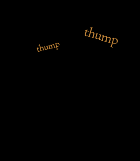
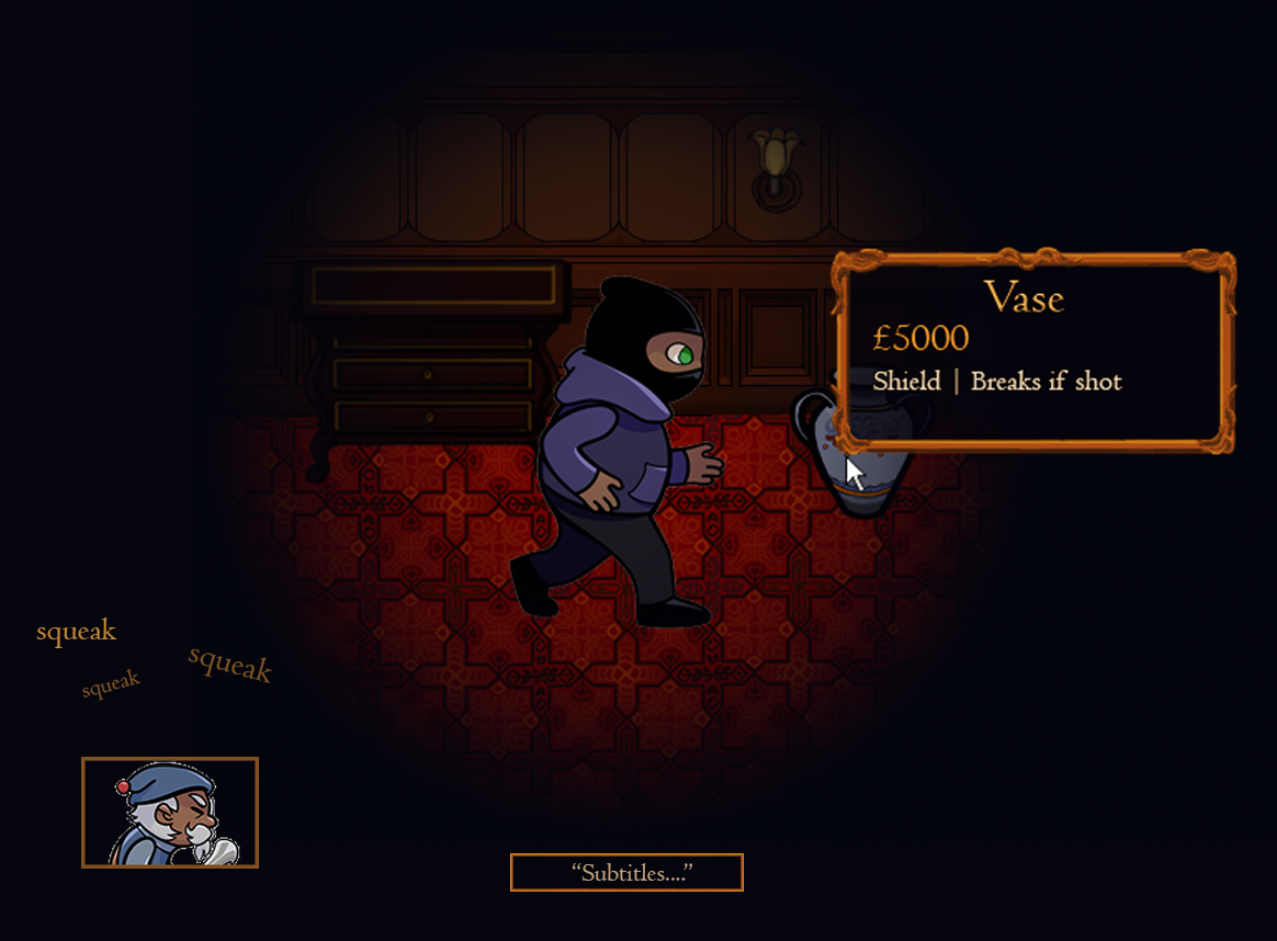
The Story of the Beginning of the HUD and the GUI In almost one week this course and my biggest project here is ending and I and my group still has lot of assets to work on. It has been fun thou and even if there has been stress it has been worth it! So this week I have been working on giving our game a nice looking HUD and GUI. In the beginning of the project we came up with the idea of subtitles to every sound in the game that was necessary to gameplay. We knew that not everyone were going to be able to use sound when playing and we did not want to lose such a big part of the experience because of something so small. Therefore, we decided to put subtitles for both Mr. Fancy’s voice lines as well as his footsteps. These are going to be represented in the HUD at the bottom of the screen and it was my job to make them. Since we, or at least I, feel like there isn’t enough time left I went with the first idea I got. This was a small animation of the footstep sounds above an icon of Mr. Fancy in the bottom, left corner. Next to this, at the centre of the screen and under the avatar, is where the subtitles will play out. These will not be animated but simply show of for a set period of time.
The other thing I have worked with is part of the GUI. We wanted there to be no confusion with our power-ups during the game so we decided to add some tooltips. In Fancy Mansion, the vase and the clock work in the same way. When the player picks it up it will work as a shield that can take one shot from Mr. Fancy and then breaks. We found no logical connection between a big clock and a significant smaller vase that would make in obvious to the player that they had the same properties. This is what the tooltips are for. They will tell the player the name, value and property of the object. It will also work as an indicator for what items can be interacted with so that there is no confusion between static interior and the stealable items. I but a little more time into this task since it is going to be shown next to the visible part of the levels. Everything there has a specific fancy style and I wanted the tooltips to fit in there. I decided to make it look like a small golden frame with some small details to make it look old and fancy. It Is filled with a semi-transparent dark blue colour so that it does not cover too much of the screen, since the vision range already is limited.
|