Space Dev 5(?) – Further Exploration of Common Household Objects
|
Alright kids, here it finally is: the Official Fancy Mansion Evironmental Artists’ Guide to Referencing. I suggest you guard this secret close to your heart, as it’ll prove vital to all your luxurious mansion drawing needs. This is an invaluable tool and I trust you’ll find yourself coming back to this guide time and time again for the entiriety of your career. But enough preamble, let’s get started. First, you’ll have to decide what piece of furniture you’re drawing. Once you have, you must carefully consider if this item is something stodgy old aristrocrat scum would have in their ridiculous mansion. A rolling office chair, for instance, is a no but let’s say you pick a regular chair That was the almost self-evident part, now, now comes the trick, the path to enlightenment, the font of inspiration, the very core of the intense artistry put into this game. You make a google image search of the furniture, but you write the word fancy in front of it. Fricking foolproof. The word ”fancy” is just so on point for the aesthetic of the game, google always returns just the stuff you need, regardless of what you’re looking for. Aside from like, flowerpots. The returns for ”fancy flowerpot” are pretty bad.
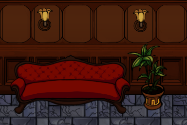
That’s it, that’s the guide. This means it’s time for me to segue into the true purpose of this post: talking about the some of the furniture I’ve drawn for the game. As is, and as it’ll still be tomorrow at the time of the beta, the whole mansion looks pretty… empty. Aside from a few bags of money haphazardly strewn around the level and the occasional piece of armour there’s just nothing going on in La Casa Grande de Señor Otto de Lujoso (which is what I wanted to name the game, by the way). So, having finished all my walls and floors and having put the elevator work on hold for reasons, I’ve been put on digital carpenting duty. Seeing as we’re supposed to only be writing about one artifact a week, let’s specifically talk about the couch. We’ve got a slightly informal style guide going something along the lines of warm colours for environment, flat colours, no more than three shades of every colour and have clean lines for everything. This is pretty much the antithesis to all I know and love, so working under these restrictions has been frustrating. It probably builds character or something though. Naturally I used the guide above for finding a few references of what a good old uncomfortable expensive couch looks like. I don’t know if people even make furniture like it anymore? I also tend to prefer to work in the resolution the final sprite will be, which makes clean lines particularily difficult on account of how every pixel becomes incredibly visible and important. Just the tiniest bit out of line starts looking off. And then you redo, do right. So the process goes references > sketch > lines > flats > shades, and lands looking something like this:
|