Dragon Song Blogpost 4
|
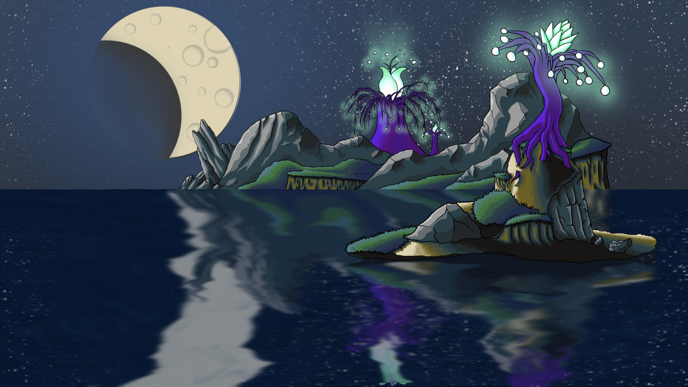
Art Interesting week. My work on the background image never feels done. There is always something that I want to add or change, but this week it has not been as clear to me as to what need to be changed or added. I have been struggling a bit with how flat the image looked in some places. Especially on the mountain in the background because it had large surfaces of basiclly the same color. I have also tried to emphasize just a little bit more that the light comes from the moon. And lastly, I have yet again added illumination from the seeds hanging in the trees, as well as from the flower this time. I also kept the color of the illumination to one color this time around, because it felt more natural. This could be easily changed later on though, depending on feedback.
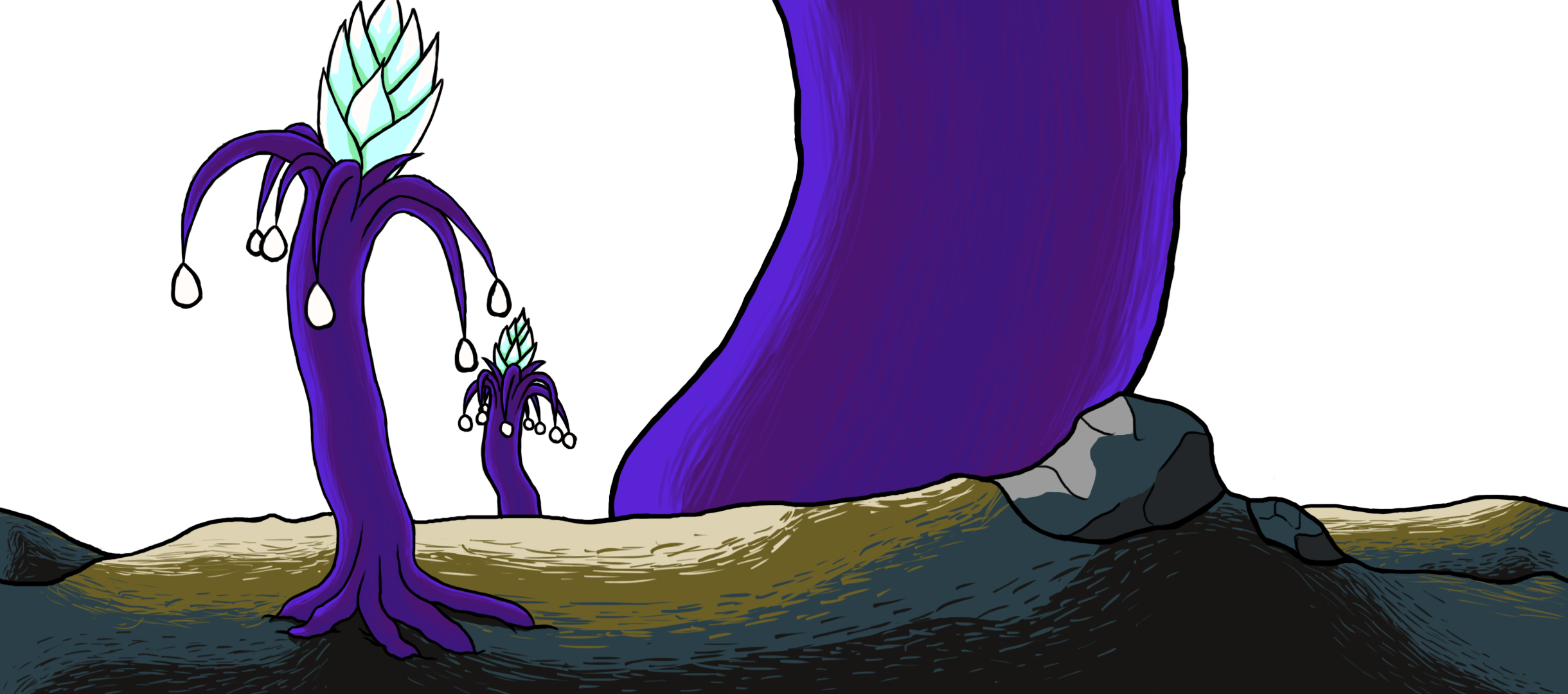
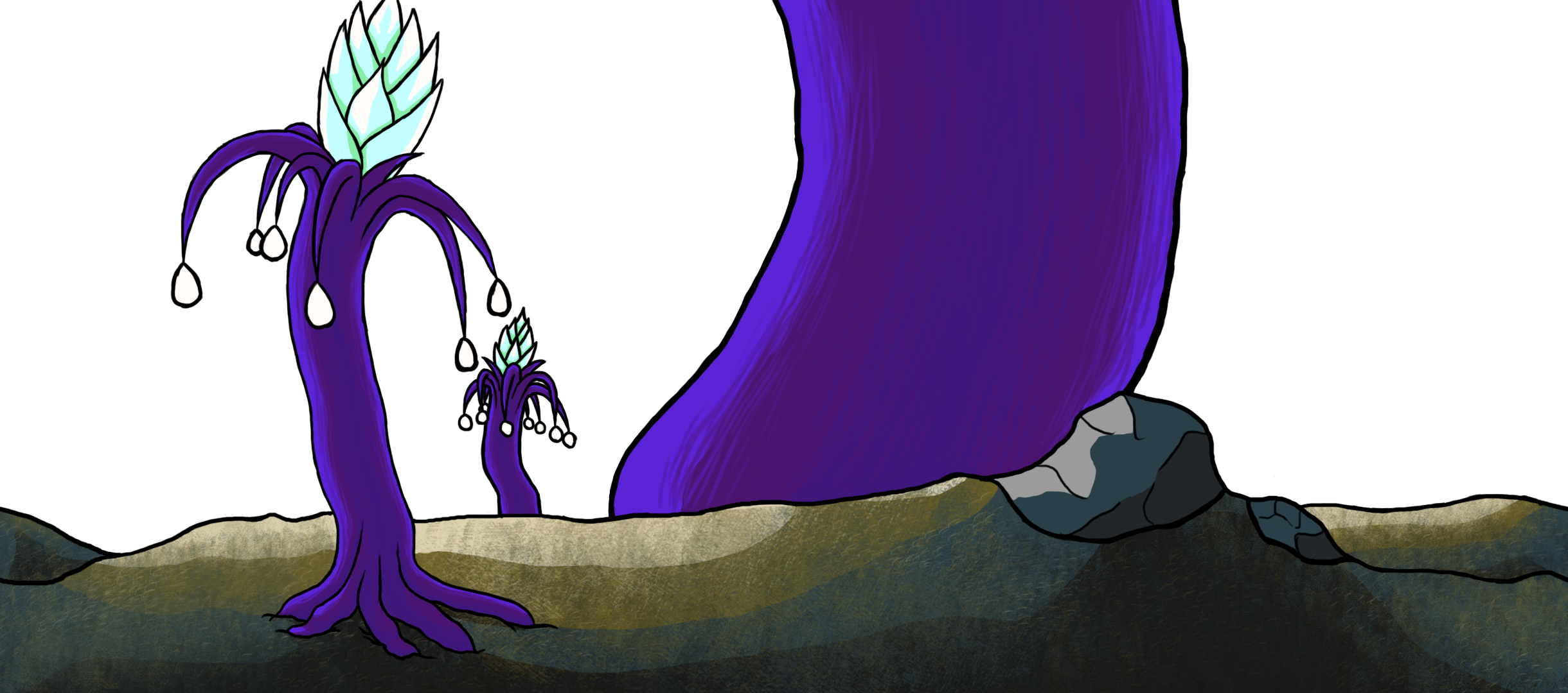
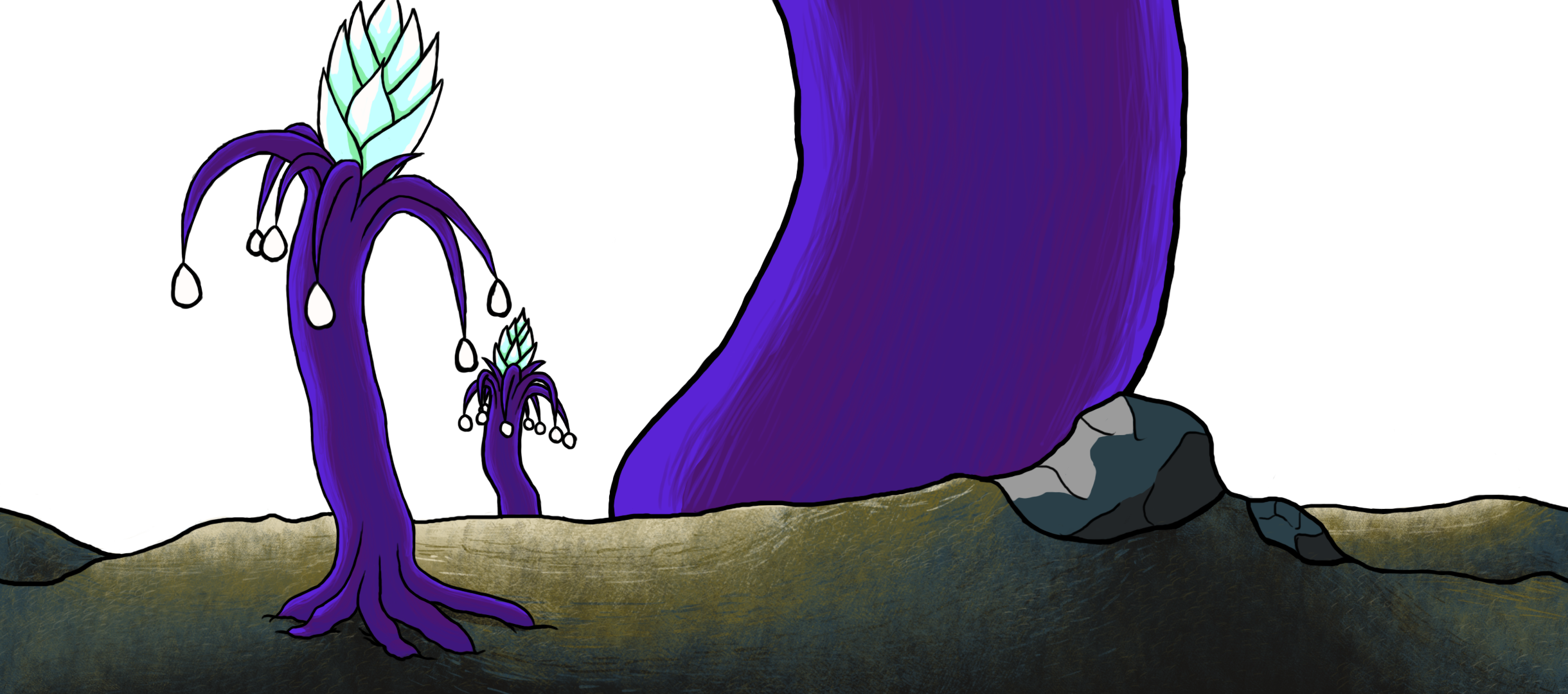
The way that I tried to emphasize when the light source was coming from a bit more, was by adding another thin highlight around the edge of the mountains. Usually when a light comes in from behind an object, it leaves a thin very bright line around the contour of the object. But since the light in my image is not coming in from exactly behind the mountains, but from a small angle to the left, I kept the thin line to the left side of the mountains and rocks. I have also been trying to add more texture to the grass, rocks and dirt. This has been the source of a lot of frustration this week. I tried several techniques and I have created a dozen new brushes in Photoshop. Here are some examples of the textures that I discarded.
My main concern was that I wanted to maintain the colors that I have used, but to provide a smoother transition between them, but at the same time I did not want the transition to be too smooth. At first I just tried doing some simple but clear brush strokes using the colors adjacent to each other. This was low effort but also looked very low effort. Hardly surprising. Next is two of the brushes that I created combined. This had a nice dirty texture to it, but lacked the smooth transition I tried to achieve. Lastly, in the third image, I combined the first to examples and added a smoother underlying transition. I was very pleased with how it all ended up looking. It had a nice rough dirty texture to it with a smooth transition between the colors. It think it looks really good. And… Then I discarded all of them. I was really happy with the results, but looking back I had noticed that I walked too far away from the art style that had been established up to this point. I had to go back and rethink how I wanted to proceed. In the end, the solution to my dilemma was simple. Add more layers of colors between the existing ones to smooth out the transition and try to avoid sharp borders between them. |