User interface design! 2D Game Project
|
Hello! The following weeks I will be blogging about the current game project which is currently four weeks in. Updates will be happening weekly and will cover a subject or artifact for the game itself that I personally was largely responsible or involved with. As I was appointed the role as Game Designer I took it upon myself to tackle the design document and of course, settle matters regarding the design decisions overall. This week, I will cover the UI design decisions for the game. Both the main menu prior to starting to play and whilst in-game. Whilst designing the user interface I had a few key points to keep in mind:
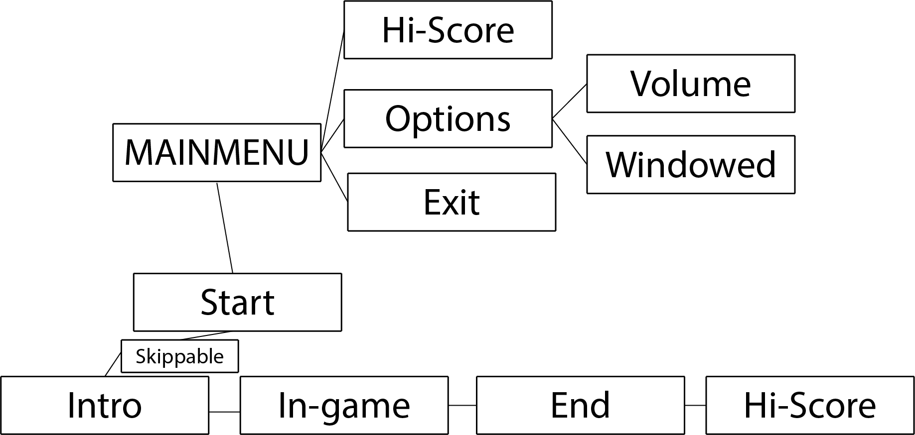
It is important to stick to the intended target platforms conventions in order to not irk your customers/users with complete unfamiliarity. I have firsthand experience at what such a design decision can do more harm than good, despite it being proven to be much more efficient and “logical” than the regular conventions are. In this case, the software used the right mouse button to select elements and units, and the left button controlled a positional tool. This is the exact opposite of what ALL operating systems use, which is left mouse button to select and deselect. You can imagine the frustration the new users had to go through in order to become familiar with the software. More often than not, they went on to lesser cost effective solutions that are consistent with the normal conventions of the operating system. Much to your surprise! The very same applies to games! (Not much of a surprise, is it?) Before proceeding I would like to recommend a few rules of thumb for good user interface design in general. http://faculty.washington.edu/jtenenbg/courses/360/f04/sessions/schneidermanGoldenRules.html Schneidermans Golden Rules of Interface design applies to pretty much everything when it comes to, well, interface design. Alright, with that said, lets put it to practice! Below is a flowchart for the navigation in the actual menu prior to starting the game, at first glance, there is nothing alien to the player and it all follows a logical pattern, what you see is what you get.
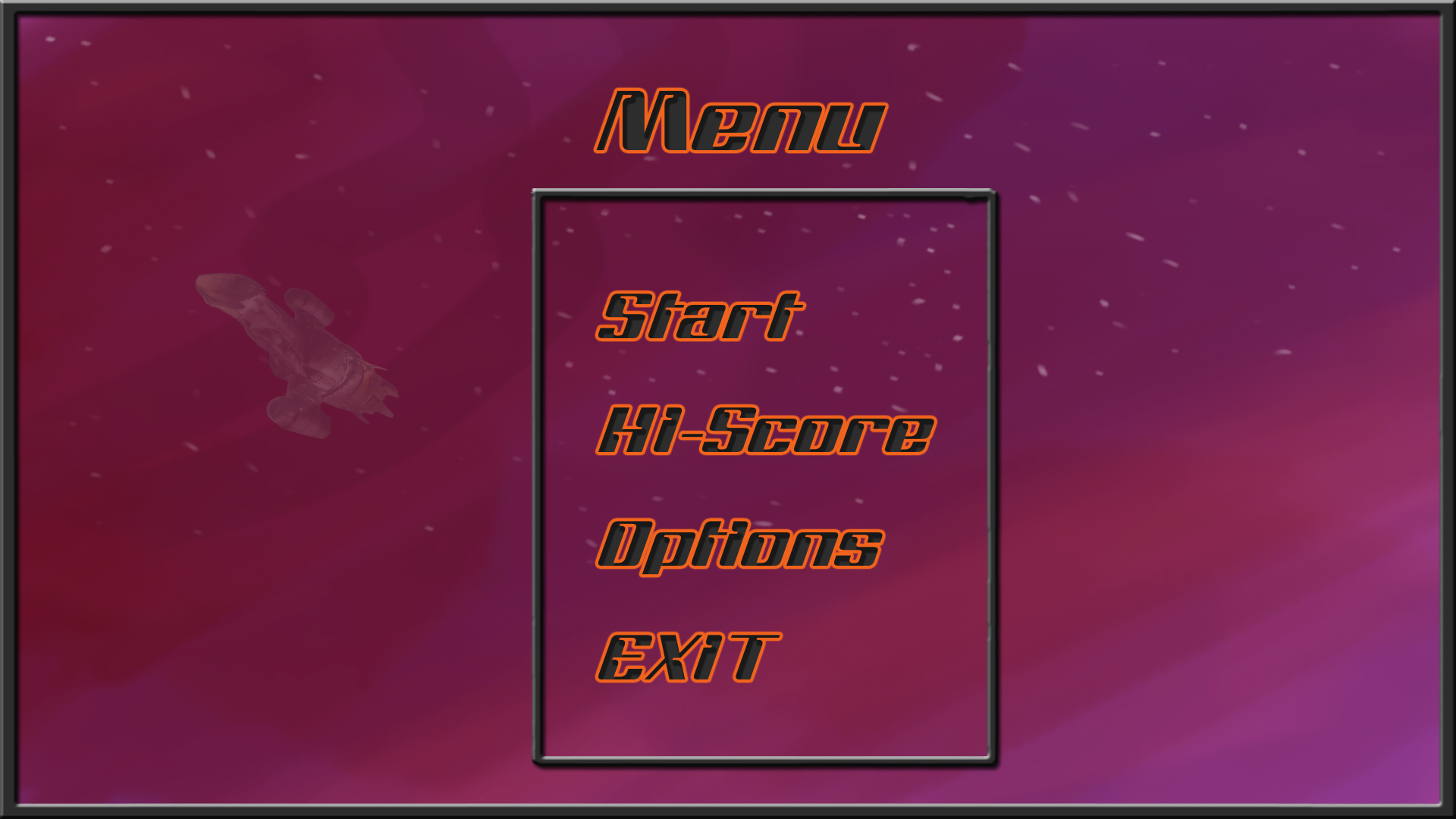
The image below is a quick sketch of what the main menu might look like, as you can see once again, pretty standard and familiar with most modern game menus, isn’t it? It probably won’t come as a shocker that the navigation is handled with the familiar, to the PC, mouse and keyboard. Of course, whatever sub menu is pre-selected, ergo, hovering above it or having selected it with the keyboard will be clearly visually displayed through highlights to distinct itself from the non-selected sub menus. Along with visual feedback, there will be a click sound in order to let the user know something happened.
And at last the in-game user interface. Same rules apply here, visual and hearing feedback is very important to keep in mind at all times. Health and Suit Power are very important stats for the player to keep track of. (Top left corner of the image) A simple yet effective way to let the player know the stats have changed is to give it a brief highlight, such as a white flash. With that visual aid including with what the player was seeing occurring in game, he will instantly know what caused the value to change.
I would like to mention the fact that all the above graphics are not the intended visuals for the final product, they are simply placeholders until they can be replaced with proper and carefully crafted visuals. I hope this was somewhat useful, I am well aware a lot of it sounds like very obvious things to keep in mind. However, despite it seeming to be glaringly obvious, you would be surprised how often interface design is overlooked in software. More often than not, this has to do with the programmer already being familiar with the software. He wrote it, it is natural to him, but it might not be as obvious to the end-user. Over and out. //Morgan |