Space Shooter Project Blog: Post #1
|
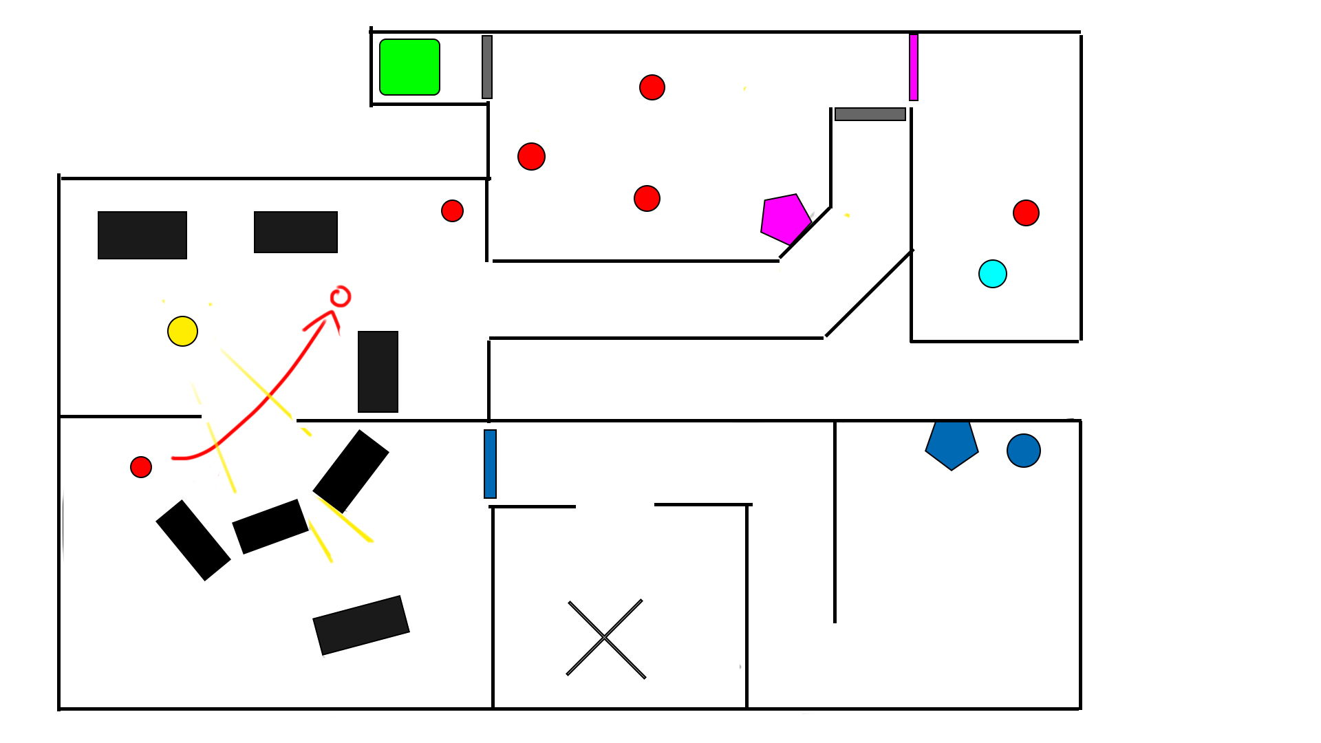
So, the construction of our space shooter is now on its fourth week. Initially the group I was working with, team 14, was split and I along with two of my team members were reassigned to team 5. In this group we decided to take the space shooter concept of another group, namely the ”Last Signal” concept. To quickly summarize, the concept was about the player taking the role of a scientist on a space ship that became infested with aliens. Narratively, the gravity on the ship is supposed to be disabled, but since we aren’t allowed to implement a gravity mechanic into the game, the player is controlled by use of thrusters on the space suit. This makes the controls feel very ”floaty” and is supposed to immerse the player in a sense of helplessness. As the concept stated the game is supposed to be very atmospheric and feature themes of horror, this suits the game well. The objective of the game is to navigate the ship and send a distress signal to be rescued. Anyway, onto the asset I have been working on for the past week, namely the very first section of the game. I was in charge of level design, and as such had to create a layout of what the levels might look like, as well as plan o how to guide the player towards their objective. It was settled that the levels were to be quite linear but allow for some minor exploration, as in looking for rooms of to the side. These rooms are not necessary for completing the game, but will award the player with a power up for having found them. The layout for the first section is depicted below.
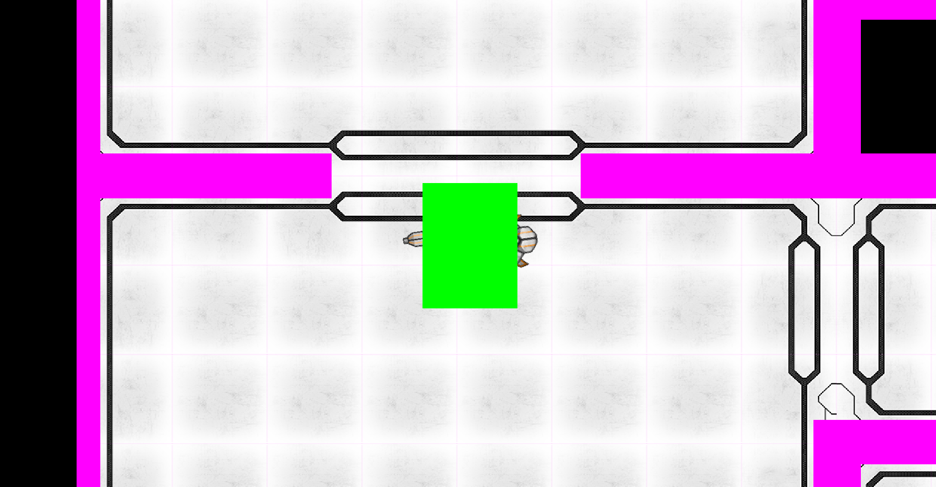
So, this layout basically tells us everything crucial to making the level, or me atleast, as I am the one putting them together in the end. Using symbols saves time and color coding the entities makes it easy to spot them. The plan behind the doors was to let the player know that consoles will open doors. The first one the player encounters will open the door at the end of the hallway, which was previously locked. This tells the player ”Hey, remember that these things open doors” in the future without having to spell it out for them. Decorative elements are not included in the map, as they are not needed for the gameplay to work or the events to play out. Speaking of events, the directed lightsource is there for a reason, and unlike the normal lighting that will happen in the game, this one is chosen for the specific task of introducing the aliens to the player. The light source is directed through an opening in the wall, towards the player’s enterance to the room. Upon entering the room, an alien will travel past the light, casting a shadow infront of the player, making him or her aware of them up ahead. This may be changed later on, and was merely an example of how to introduce the enemies. Using a light source to contrast the darkened environment that we will have in the finished game, will also help guide the player along the level, especially if it is placed abnormally compared to the rest of the lights. It makes it stand out and catch the player’s eye. I said before that I will be the one putting the levels together as well as designing them, and that I have done for this first section. Below is an image of how the environment will look to the player ingame. The green box covering the player is the hitbox and the pink ones are the hitboxes for the walls. A collision between the green and pink box will result in the player stopping and bouncing backwards, away from the wall.
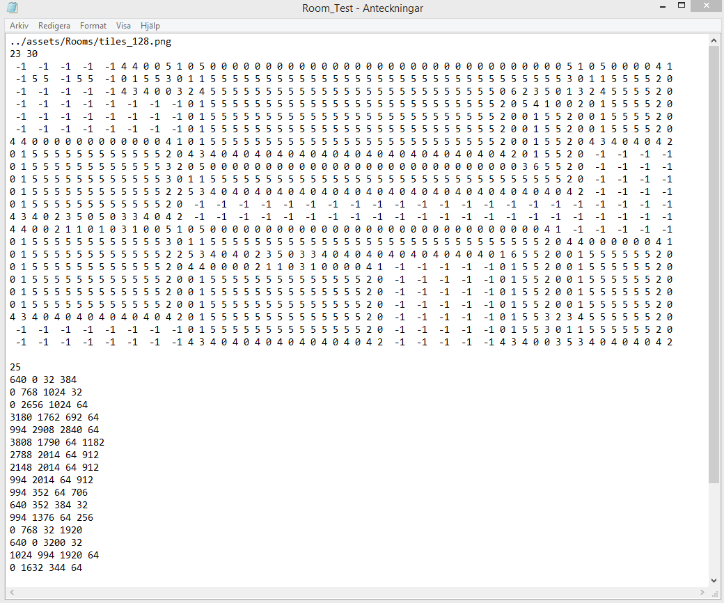
The entire map is built with tiles, square images that represent the walls and floor. By editing the textfile responsible for placing the tiles, I can choose how many rows and columns of tiles there will be in the section. If you look closely at the image, you can see squares in the floor, each one is a single tile. Editing the map is quite time consuming, as each tile has to be placed individually. In the textfile for the map generation, this is what it looks like:
The upper half of the file which is a huge wall of numbers, decides which tiles go where. The first two rows choose the file from which the tiles are selected and how many rows and columns there will be. This will take a long time to explain, so I will try to be as brief as possible. The number ”-1” means a tile space is empty. The others are the positions of the tiles in the image where they are stored. The number ”4 4” in that case means the tile in row 4, column 4 in that image. The lower half of the file decides the amount of hitboxes and their coordinates. The very first number on top of there coordinates indicate how many hitboxes are to be placed. I struggled for a good while with the hitboxes as I had seemingly deleted this number when I first edited the map and I would frequently forget what hitbox went where and how far away coordinates where in relation to each other, so I started keeping notes on the side to remind me where everything was. The initial section of the game has some large rooms for the players to practice navigating using the thrusters, but are also not quite limited on enemies so they are not overwhelmed so early. Two enemies in the initial encounter should give the player a good idea of how to fight while also making it somewhat challenging. The narrative situation is supposed to be quite dire after all. That’s all right now. More work awaits. |