The font that God forgot
|
A highly incomplete piece, this rendition of a baptismal font has yet to see better days, but someday it hopefully will. The thoughts of the style are definitively meant to be angle towards Skyrim more than Asterix and Obelix, even if the simpleness of the mesh and texture tell another tale, although there is still a considerable journey left to undertake before it achieves that lofty goal. Speaking of lofty goals, the motivations behind the attempt of making it in that style is primarily fuelled by the secret desire to one day on a game such as the much-praised Bethesda-made rpg (although with an artstyle and historical focus more in the direction of Deliverance: Kingdom Come, but that’s splitting hairs.) The scheme is once again the favoured monochromatic one, partly because of the referenced piece itself, but mostly because of the unease of rocking the metaphorical boat by being too adventurous in a time crammed to the brim with deadlines, minor illnesses and technical obstructions. The main colour is yellow, with brown and almost the hint of a slightly not-at-all-green-but-still-somehow-giving-the-impression-of-something-nearing-green-ish hue. Although that may be because I’ve been staring at its picture for too long. At any rate, it was chosen because yellow in stone is what this one associate with the things of yore, incredibly broad sweep that it may be. It is also good for catching the eye and it in this humble opinion gives off the feeling of brimming with the weight of history, plus it works great with the dodge tool when making highlights. While mostly saturated, with plenty of highlights, the shadows are given more hue to further denote the differences betwixt the dark and the light, with the carvings and other details brightened, or rather bleached, to make them properly stand out. One can say that the colours are definitively wading in the warmer pool as opposed to the coldness one would normally associate with stone.
The uv, being horribly rushed and quite unfortunately turned upside down certainly made a stressed mind ever so slightly more stressed, and while intentions were good and ambitions high, the notions of 8 unique carved images and 4 equally unique faces were swiftly turned to dust as time came crashing down. As such, the diffuse suffered because of it, just as the silhouette of the mesh itself remained low in detail and poor of execution.
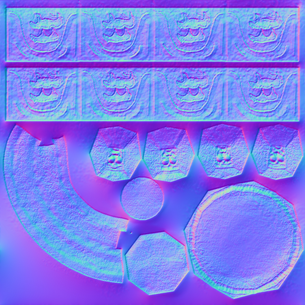
As for the normal map, it once again proved how brilliant Crazy Bump is, especially compared to the bump mapping plug in for gimp that one has been stuck with using in the past. The main job of the normal being to accentuate the carvings and the coarseness of the surface texture, being the veritable cavalry that comes in the diffuse’s time of need, while not necessary saving the day but at least giving it a fighting chance, one last blaze of glory one could say.
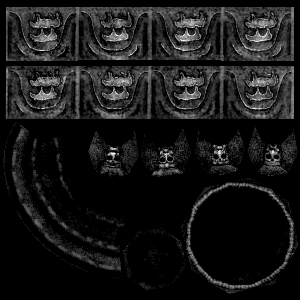
Meanwhile the specular is there for one thing and one thing alone, aiding the normal. Doing its work by accentuating the carvings and the edges while giving but the slightest of glints to the recesses of the stone.
|