Week 37: Visual Styles in Games and Creating Simple 3D Game Assets
|
This week we’ve been through the menus and tools in 3DS Max to a greater extent, to then apply what we’ve learned onto various objects that we make. Namely crates. Having several themes to choose from, I made an attempt to create objects from an Urban, Cartoon and Sci-Fi setting. Not just because they were the easiest to distinguish between, but also because they would enable me to experiment a lot more with shapes in very distinct ways.
Urban
Characteristics:
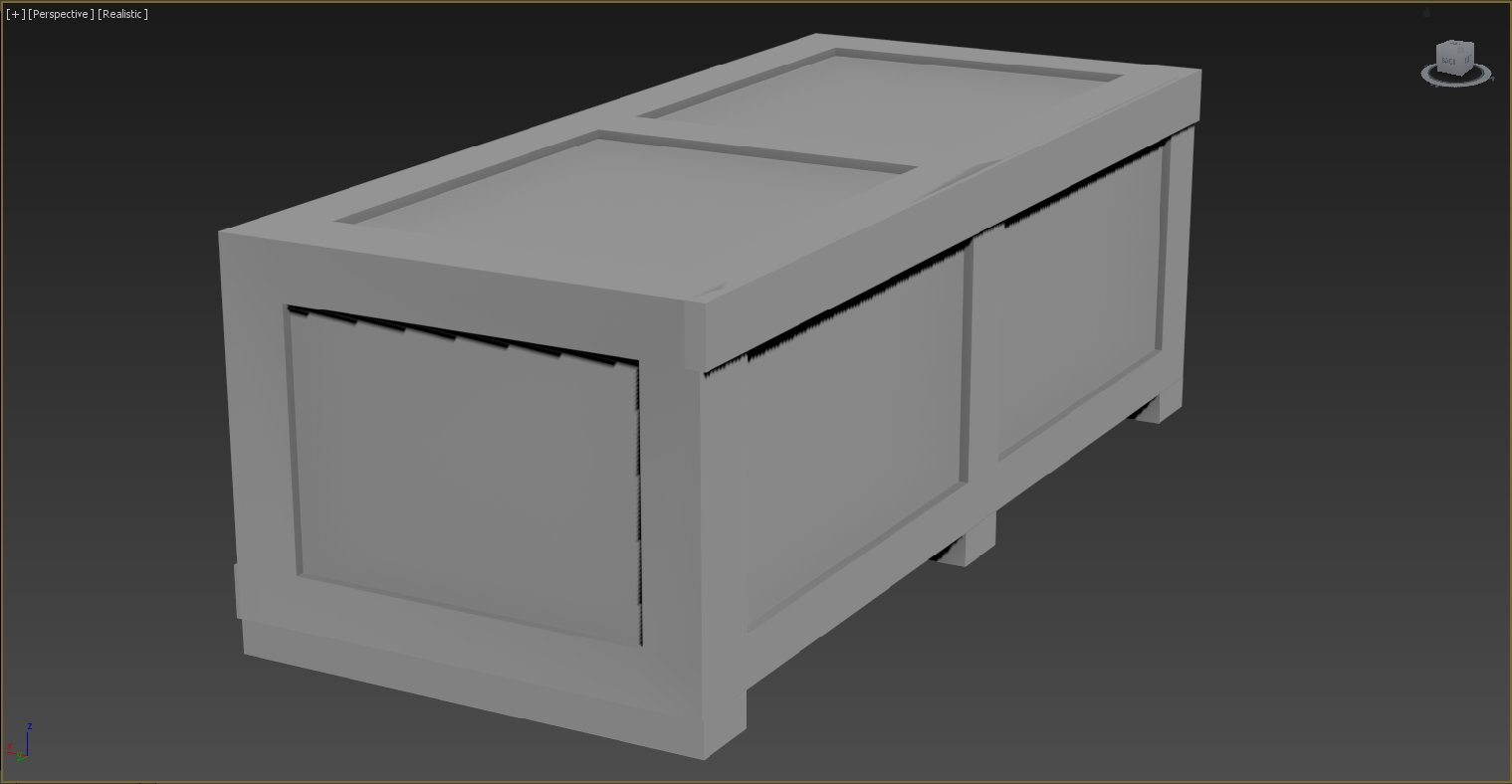
I started off with the Urban one, as it was relatively easy to do with just some basic understanding of extrusion and attaching the objects together. Swift Loop made the whole process simpler by being able to assign sections correlating correctly around the entire object.
It did make giving it some sort of distinct character difficult though, as in realistic terms it really is just a couple of planks of plywood that have been neatly, if quickly, slapped together. I know the texture will remedy that, but it’s tricky to show what you intend when you’ve only done the model itself. I mainly took inspiration from Half Life 2’s props, as they nail home the aesthetics I link to this setting. While practical it gives a sense of an utter lack of craftsmanship or any thought of sustainability. A world where the environment is neglected for the sake of efficient transportation. I tried giving certain sections of it irregularities which could give it the impression of having been made by human hands and not in a software program. Again, such details aren’t very noticeable.
Cartoon
Characteristics:
When it comes to cartoons it can vary from the realistic to the absurd, depending on what tone and setting you’re looking for. I went for a simpler style, with soft edges and mild extrusions just to give some sense of complexity beyond flat surfaces.
I was more or less inspired by the boxes often found in Super Mario, who despite their iconic design have a fairly simple structure. This is probably the reason why they’re so memorable, their rudimentary appearance helping to highlight their aesthetics. Thus enabling the player to notice and focus on it better. From Mario to Bandicoot, cartoons appear more reliant on colouring than any real defining model to be realised. All it took was to soften the edges with the Chamfer tool. Sci-Fi
Characteristics:
Now I start to become adventurous. I wanted to do something compact with a fair amount of detail while still having a consistent design that made sense for a no doubt heavily industrialised setting, where it needs to be transported on factory railways and be stored in secure facilities (and be resistant to extra-terrestrial elements no doubt). A lot of sharp edges, but also some amount of sleekness to make it seem more flexible when being handled. Ergonomics aside, I think I did well. Even details such as the opening lid were made successfully. The parallel bars on its sides meant to be interlocked in some other system like being part of a larger machine.
Mass Effect sprung to mind fairly quickly with its rather distinct-looking props. It’s a setting so overabundant in resources that most concerns over cost-efficiency is non-existent. Instead of having to worry about how to transport material as cheaply as possible you are more likely concerned over how to deliver goods safely across astronomical distances and through cosmic forces that could ruin your day in countless ways. I’d say it’s easier giving it a distinct shape in this particular setting, as it involves technologies that can be nowhere near what we have in real life. As long as you have some sort of reasoning for its shape and components you can go in pretty much any direction you like.
Summary and Conclusion Going through the tools and menus of the software were of great help. Just by learning a simple method, in this case using the Swift Loop along with extrusions and chamfer applied to edges I could construct consistent objects down to simple detail. Which is all you really need in most cases as you let the textures fill in the blanks afterwards. Despite this progress, I have yet to move beyond the basics of the software. I often find myself stumbling in the dark uncertain over how to proceed. This is however a simple issue of inexperience. It will no doubt be easier the more time I spend on refining my skill. I’m still in the phase where it takes longer finding the tools you want rather than putting effort into the actual model I’m building. But I’ve learned some neat tricks already! It feels like a long upwards hill, but the more time I put into it the faster I’ll break free of the initial hampering and be able to utilise the software to a much more refined result. It isn’t as much about learning how to wield the tools available as it is about learning how to see. If you are able to understand what the theme or art style actually is through observation you can understand how to capture those elements yourself. It’s a language that enables you to comprehend how and why different styles works and gives their respective games their own tone and feel. It allows you to study the aesthetic detail of an experience and learn how it works for better or worse. This can be a useful way to know not just what differentiates the varying styles and themes, but also how that knowledge can be applied to your own work, especially when you’re part of a work force with shifting views and ideas. That’s it for this week. Until next time!
Björn Erik Berndtsson. Graphics and Game Design. |