Terminal: Fly City
|
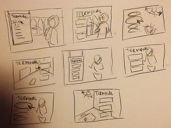
After the Alpha we felt that we really wanted to have a main menu for the Beta presentation and moved it up on our priority list. I started right away with doing some really fast sketches, trying to explore different ideas and layouts. Some ideas that we had did not fit the game we are creating, for instance, we had an idea of the interrogation room where the game starts, with a flickering lamp. This put on paper looked like it would fit better on a 1930s inspired mafia or crime game.
Below are some of the sketches I came up with, the two on the top left and the right middle one were the ones I felt fit the concept of the game best as they show that you are at an airport, they show the main character looking worried or fleeing and they fit the comic book theme. The one we chose to work on was the middle one on the top since that was the one that best incorporated everything the game is supposed to be.
 I already had some photos from Sky City in Arlanda in our inspiration folder that I used for inspiration. I felt that those huge windows and the shiny wooden floor was very inspiring and I wanted to create a sunset coming through the windows both to establish the time of day of the game and to incorporate the purple colour scheme we have chosen. For the style of the scene I chose to take inspiration from Ms Marvel, which has very thin line art, lots of smooth gradients, soft highlights and subtle textures.
 I spent many hours doing a rough sketch and turning it into clean line art. Since the buttons will go on the left I decided to leave that area a bit empty to keep it from looking too busy. The main character will be positioned in the right part and therefore I chose to put the beautiful spiral staircase between them so it would not be covered. Next thing was getting the basic values down, deciding where the light and shadows will be.
Many hours followed after that rendering it and reworking things that did not look right. The technique I used was to first block out and then use smudge tool to blend them, working over the entire image the whole time and not getting into detail. I went over it several times, each time getting more and more into detail before adding the final touches with highlights, giving more detail where needed. I will show you some of the steps, from line art to finished drawing of “Fly City”, so that you can see how I have been working. 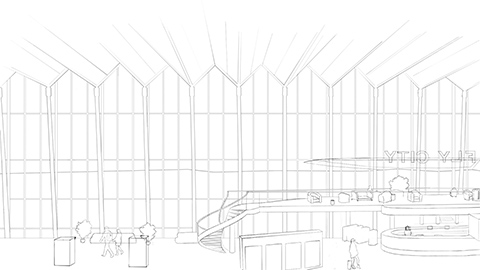 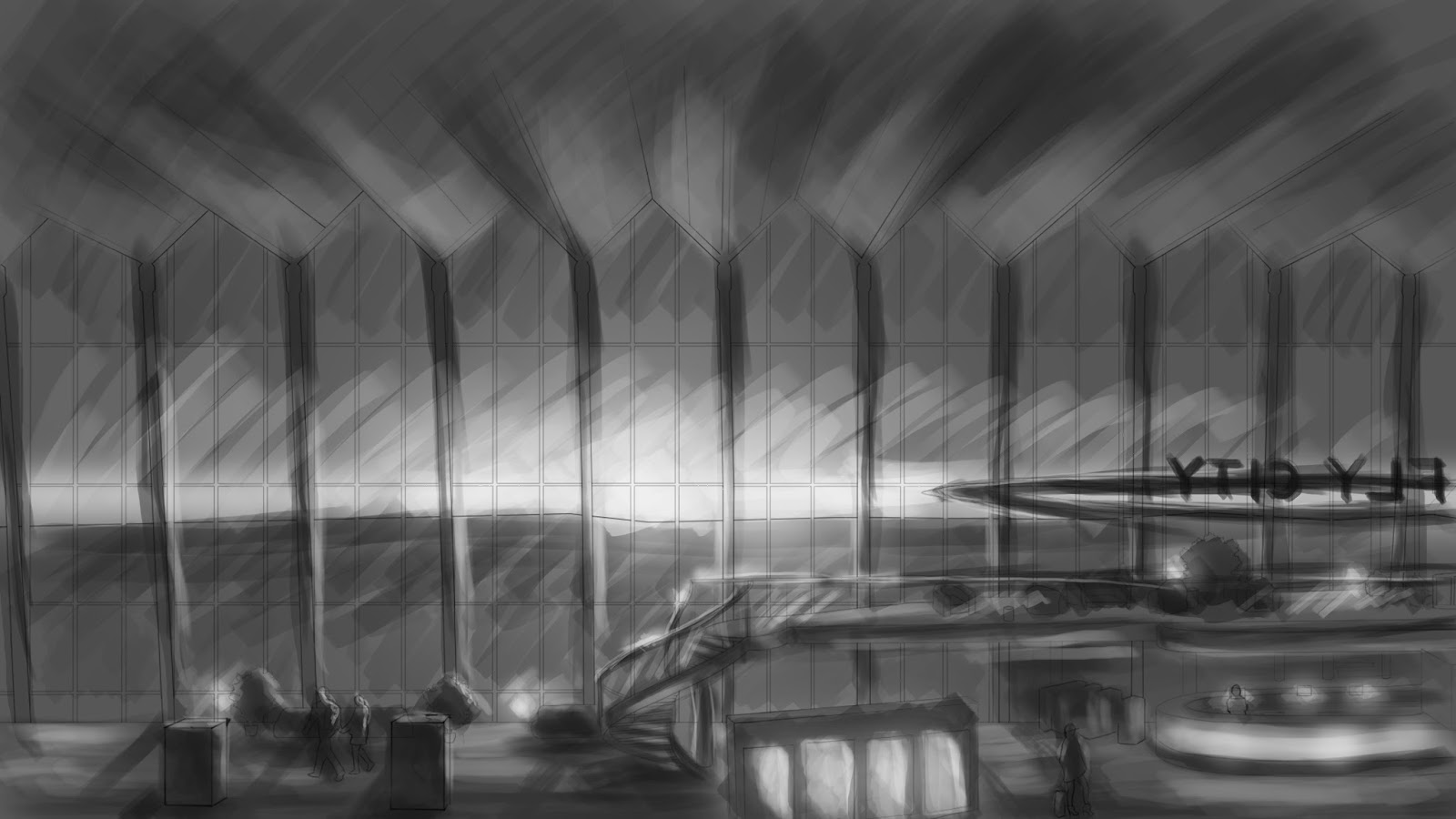 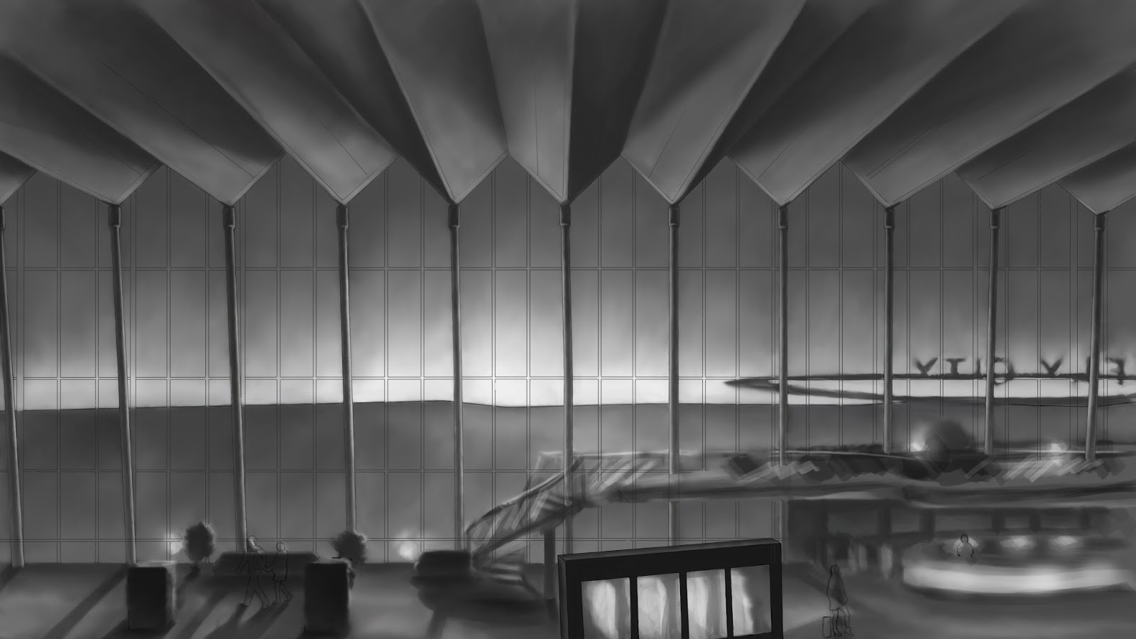 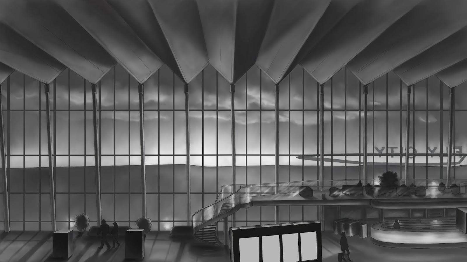 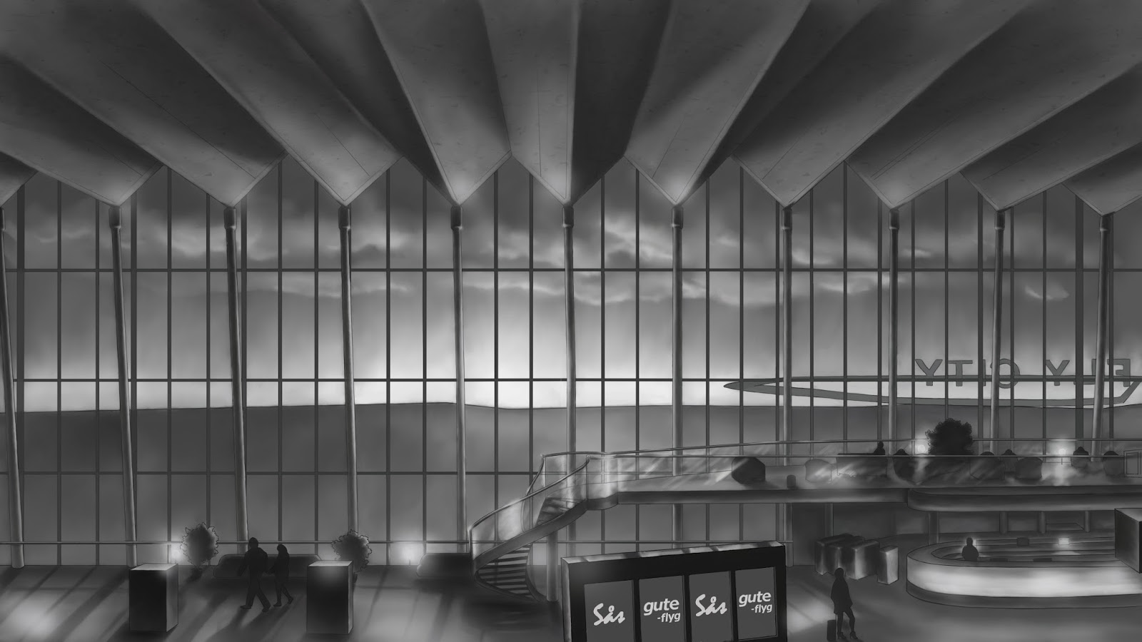 Creating this image took me many hours, I need to practice doing things like this more often so that I will get faster. I have been trying to utilize what I have learnt since I started at GAME, especially line art and atmospheric perspective, making things darker in the top, lighter in the bottom and using more contrast and darker colours closer to the viewer and vice versa. We have after choosing this design thought about using an arrival/departure sign for the menu, however I feel that it will look empty since there will be only four options on the main menu (originally only three). The space between the buttons will allow us to use more space on the screen without it looking empty and they will still be inspired by an arrival/departure sign.
|