Project Terminal – Developing a Style
|
Good evening! We’re on week six now and the project is going well. I spend most of my time making the different animations for our guard. Though this week I’ve mostly been revamping the already existing animations due to our change in style. So this week I’ll rather write about our process in developing a distinct style for our game. The primary critique that we received from our playtest had to do with the style of our game. We got several comments that used the word “sterile” to define our level. We interpreted this as them trying to say that our graphics didn’t have any kind of style at all and basically was very clean and plainly colored. Us artists in the group have had the feeling that something felt a bit off, and this helped us define it. We needed to define and integrate our style more into our work. Here is a picture of what an early prototype of our first level looked like. Mind you, this has changed drastically by now as it is work in progress. This is just to show the colors we had in our level.
As you can see the level is dominated by pure greys and white. Secondary colors are mostly different versions of blue, some dark red tones and the strong green tone on the plants. My theory is that the sterile feel has to come from all the grey. Nothing in the world looks like pure grey or white. The lighting affects grey and white objects to give them a slight hue. Therefor we should begin with adding a slight tone or all our tiles. Here comes a picture of our player in the level.
If you look at the environment and the player for a while, you might notice that their color schemes are very different. The environment goes mostly in desaturated tones while the player sports very saturated colors. This is because we didn’t have any knowledge in color theory and in how to create a style guide. I do not have a screenshot with our HUD in the level, but same goes there. All artists had just jumped into production and made things up individually as we went. But this is changing! Since last week, we have been working on how to create the right mood in our game. This Wednesday we had a second year student look over our work and give us tips. We also got our lecture in color theory and in creating a style, so we feel much more grounded now. We have a moodboard and we have a document with the basic rules of our style, like line thickness and which colors will be dominant in which level. We are still experimenting with adding different color filters on our tiles to find the perfect feel in our levels. It should be set during next week. I’m really looking forward to seeing the style come forward in game!
Moodboard, with lots of turqoise, blue and purple tones. The pictures are taken from Drive, Hotline Miami, Ms Marvel and random airports.
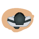
Before and after the make over. The new guard, with line work in color and some more details.
Until next time! |